
My logo, not my name!
I designed my current identity last year, and I've been very happy with it. It took me a long while to develop and it went through many iterations before I settled on what felt just right to me.
This past weekend in my online meanderings I came across another photographer with a very similar identity. The icon portion of his logo was eerily close to mine. I quickly searched his blog and found that he had created his four years before I designed mine! He's a full-time photographer and fairly well known in his specific field, and he happens to shoot a lot of automotive photography, which I would like to get into.
And the kicker is, he's located here in Greenville. Bummer. If he were across the country, it wouldn't be a real problem, as I don't see myself ever reaching that far. But he's practically in my back yard!
So, the logo needs a refresh after less than a year!
I really like what I've come up with though. Check it out.
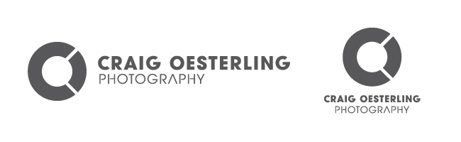
Here's my previous identity, in gray for simplicity's sake:
I designed my current identity last year, and I've been very happy with it. It took me a long while to develop and it went through many iterations before I settled on what felt just right to me.
This past weekend in my online meanderings I came across another photographer with a very similar identity. The icon portion of his logo was eerily close to mine. I quickly searched his blog and found that he had created his four years before I designed mine! He's a full-time photographer and fairly well known in his specific field, and he happens to shoot a lot of automotive photography, which I would like to get into.
And the kicker is, he's located here in Greenville. Bummer. If he were across the country, it wouldn't be a real problem, as I don't see myself ever reaching that far. But he's practically in my back yard!
So, the logo needs a refresh after less than a year!
I really like what I've come up with though. Check it out.
Here's my previous identity, in gray for simplicity's sake:
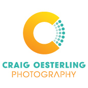
Here's my new identity! White, grayscale, and full beautiful color!
The horizontal version is at the top of this page and across the whole site.
The horizontal version is at the top of this page and across the whole site.
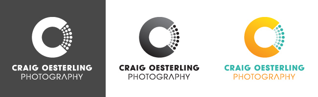
As you can see, I didn't alter it too much. In fact, the typography for "Craig Oesterling Photography" didn't change. I'm madly attached to the overall CO letter combo thing working as one letter over the other. As I'm blessed with these very similar letters for my initials, I'm going to make use of this motif.
The small changes I made to the overall structure—replacing the "O" wedge with the expanding dots, the subtle gradient in the multi-hued versions, and the addition of the orange-yellow to the turquoise—differentiate my identity from the other guy's very clearly. Most important is the dot pattern. I don't know if I can put it into words exactly, but that simple change really is enough to make the problem completely disappear.
I'm very excited about this update, and I like it even better than the original! As my wife said, whenever I have a project that I'm forced to rework, I manage to come up with a more pleasing solution that accomplishes its purpose and satisfies my creative needs. God has blessed me in that way. If you have to redo a project, look at it as an opportunity to improve and be even more creative!
This logo conflict—thankfully—was something I discovered on my own. The other photographer didn't contact me, and has most likely never heard of me. I just want to be proactive in fixing the problem before it becomes a problem!
And if you're wondering, here's a screenshot of his icon:

Thanks for reading this far (if you have). Drop me a comment if you like my new logo. If you don't like it, well, you can at least tell me you like my writing. ;-)
Seriously though, I'd like to hear your thoughts on it.
Seriously though, I'd like to hear your thoughts on it.
 RSS Feed
