
I've had 115 unique users visit my site today! That's definitely a record for me. Awesome! Thanks everyone.
 My logo, not my name! I designed my current identity last year, and I've been very happy with it. It took me a long while to develop and it went through many iterations before I settled on what felt just right to me. This past weekend in my online meanderings I came across another photographer with a very similar identity. The icon portion of his logo was eerily close to mine. I quickly searched his blog and found that he had created his four years before I designed mine! He's a full-time photographer and fairly well known in his specific field, and he happens to shoot a lot of automotive photography, which I would like to get into. And the kicker is, he's located here in Greenville. Bummer. If he were across the country, it wouldn't be a real problem, as I don't see myself ever reaching that far. But he's practically in my back yard! So, the logo needs a refresh after less than a year! I really like what I've come up with though. Check it out. Here's my previous identity, in gray for simplicity's sake: 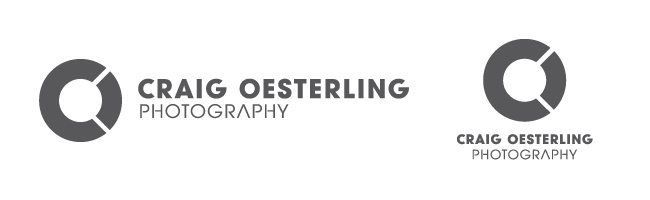
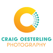
Here's my new identity! White, grayscale, and full beautiful color! The horizontal version is at the top of this page and across the whole site. 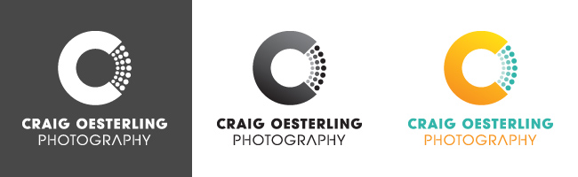
As you can see, I didn't alter it too much. In fact, the typography for "Craig Oesterling Photography" didn't change. I'm madly attached to the overall CO letter combo thing working as one letter over the other. As I'm blessed with these very similar letters for my initials, I'm going to make use of this motif. The small changes I made to the overall structure—replacing the "O" wedge with the expanding dots, the subtle gradient in the multi-hued versions, and the addition of the orange-yellow to the turquoise—differentiate my identity from the other guy's very clearly. Most important is the dot pattern. I don't know if I can put it into words exactly, but that simple change really is enough to make the problem completely disappear. I'm very excited about this update, and I like it even better than the original! As my wife said, whenever I have a project that I'm forced to rework, I manage to come up with a more pleasing solution that accomplishes its purpose and satisfies my creative needs. God has blessed me in that way. If you have to redo a project, look at it as an opportunity to improve and be even more creative! This logo conflict—thankfully—was something I discovered on my own. The other photographer didn't contact me, and has most likely never heard of me. I just want to be proactive in fixing the problem before it becomes a problem! And if you're wondering, here's a screenshot of his icon: 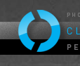
Thanks for reading this far (if you have). Drop me a comment if you like my new logo. If you don't like it, well, you can at least tell me you like my writing. ;-)
Seriously though, I'd like to hear your thoughts on it. I just bought a new camera, and it's a pretty major upgrade for me. It's a full-frame Canon 6D! The 24-105 f/4 L lens came with it too, so that's my first L lens. I'm super excited about it all! Also, I've put together an HDR image that I'm really happy with. I've just dabbled in HDR before, and never liked the results. This is different. There's some serious potential with the new method I tried. Here's the result: 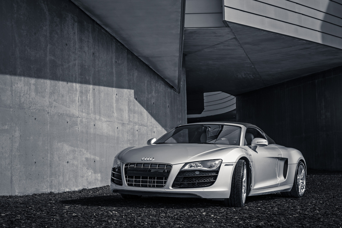
Audi R8 V10 Spyder
If it doesn't look like HDR to you, that's a good thing. You're probably thinking of those crazy haloed, gray-cloud-studded images with eye-searing color and no negative space to rest your eye. Just look up "hdr" in google and you'll see what I mean.
This is similar to the panorama work I do pretty regularly. Instead of stitching images together in a line though, this method stacks images on top of each other and aligns them. So the Audi image above is made from 5 shots I took, handheld, over a range of exposures. The idea is to retain detail from the deep blacks all the way to the brightest highlights. Then when editing, I can pull out that detail where I want it. It's pretty cool stuff, if handled correctly. I just wanted to put up a few of the shots I took last spring at my brother-in-law's beach wedding! I'll have to add more later. My plan is not to get into doing many weddings. Maybe 1 or 2 small ones, here and there. We'll see . . . This is just a smattering of shots. It was definitely a big challenge for me, and a good experience. We shot at three locations, one of which was a 30 minute drive, and I didn't even have a shot list. I'll insist on that in the future! I think I delivered about 280 edited images! 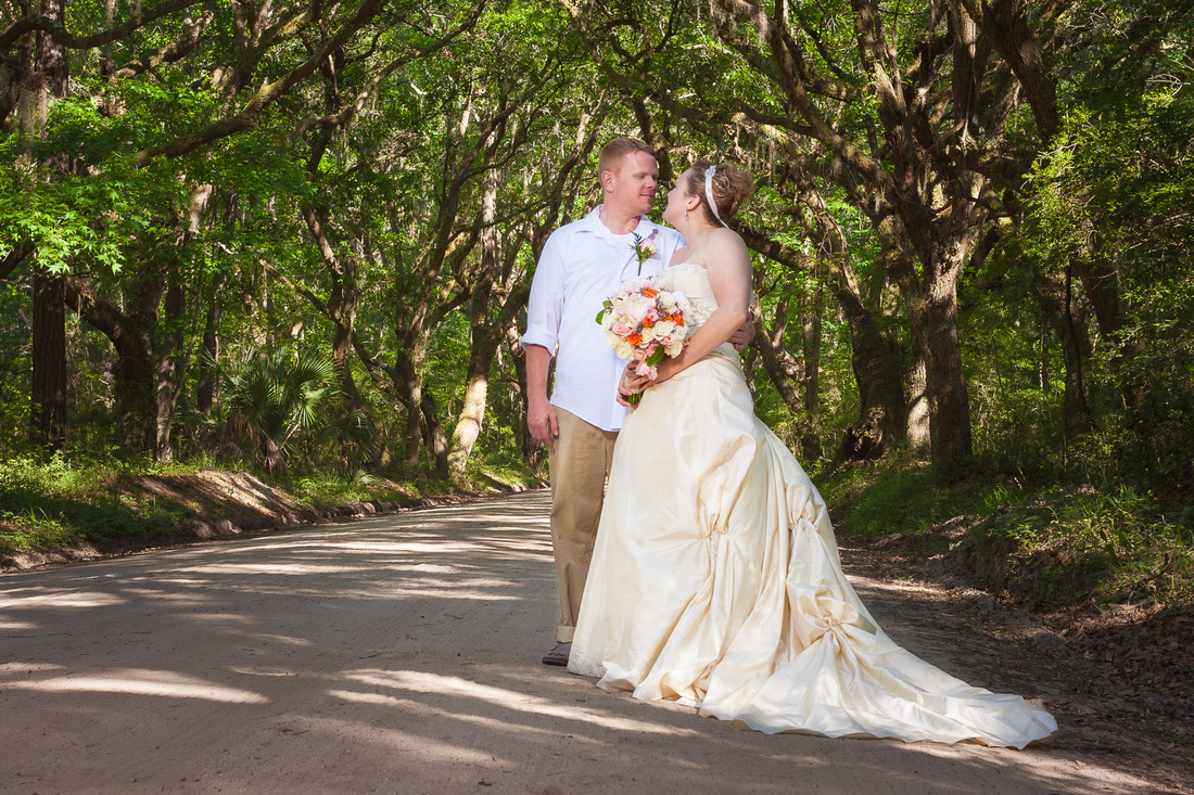 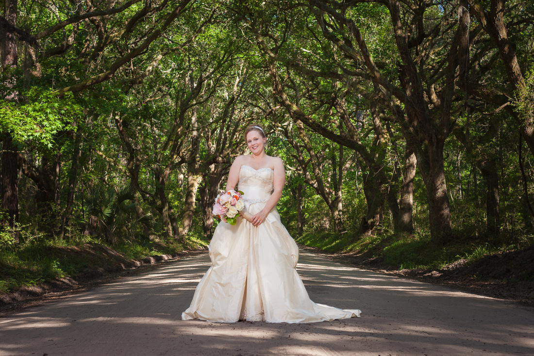 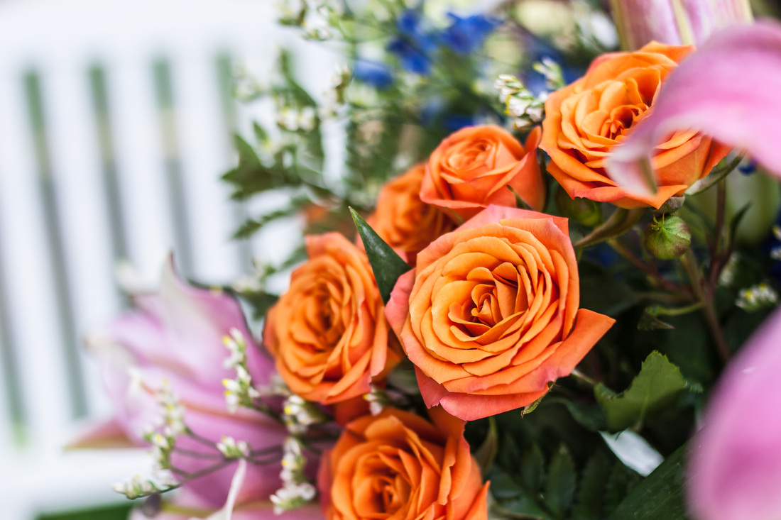 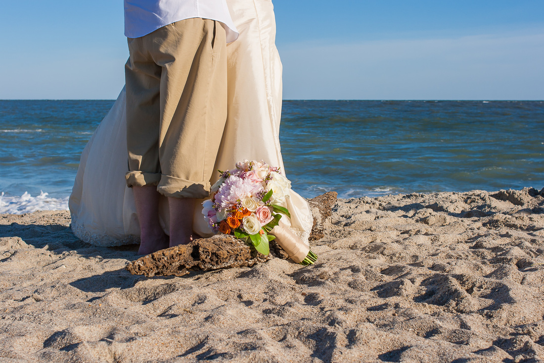 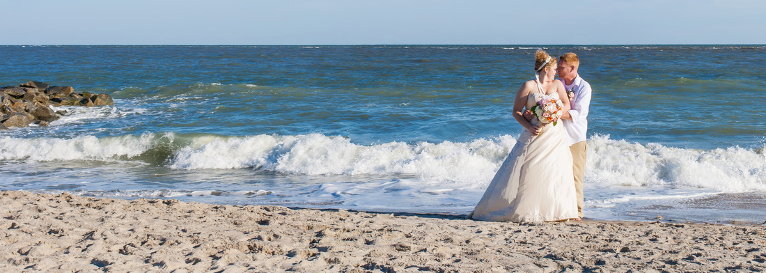 Here's one of my multi-shot panoramas. I love it! 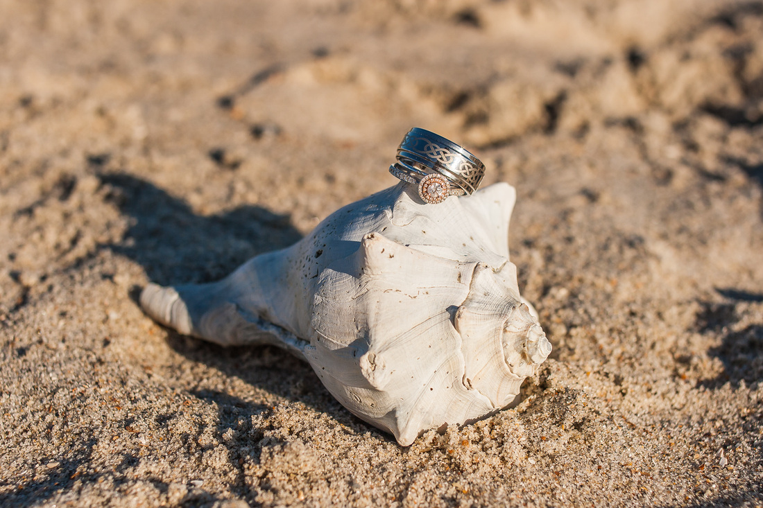 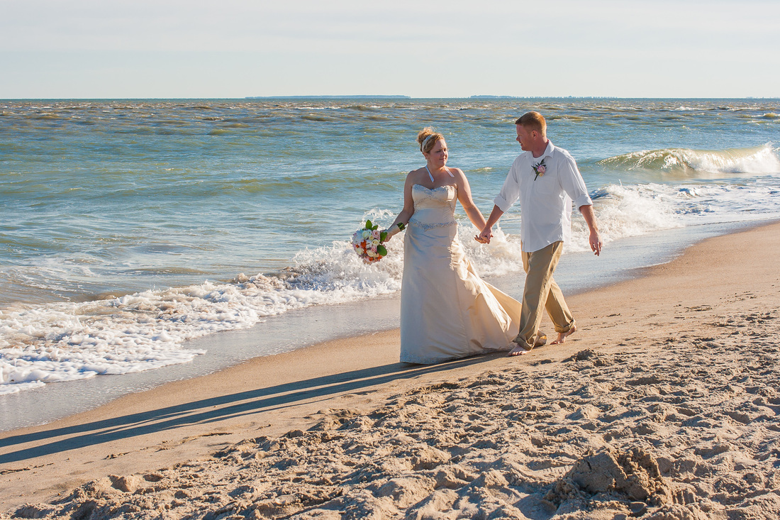
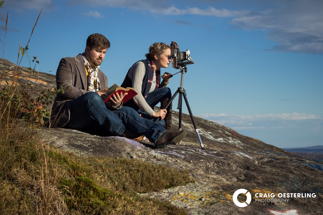
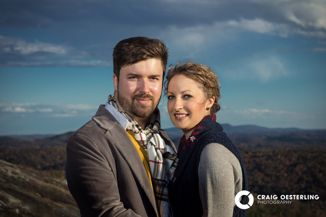
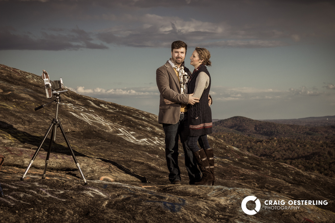
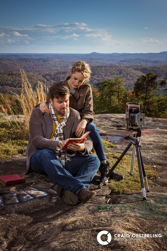
Early in November I had the opportunity to go up into the foothills of South Carolina's upstate to shoot some portraits of a great-looking couple, Dave & Rachel. We chatted a bit beforehand about the direction we wanted to go with the pictures, and decided to try some type of casual Fall fashion style with an epic location. Bald Rock turned out to be perfect for this set! I contacted Dave & Rachel because I wanted a couple with creativity, who would collaborate with me on the shoot and have valuable ideas for what we could try. At the moment, one of the things I struggle most with is bringing out the right expression in my subjects. Usually it's not too difficult, as I've mostly shot for happy families who want happy–family pictures! But I wanted something a little different this time. These two did a great job with their expressions, working together to give each image it's own feel. And they brought some pretty cool props! Check out this sampling from their gallery! 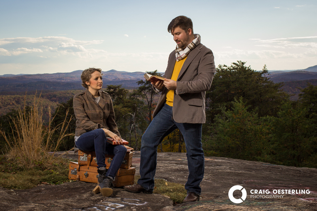
Aren't they great?!
This whole mountain adventure was also a chance for me to play with lighting. Obviously for most of these I had beautiful, bright, direct, . . . harsh sunlight. Which is what I was planning for. So I used my strobe (an Alien Bee B-800) with a beauty dish and sock to fill in the shadows. It's a matter of getting the ratios right; balancing sunlight and artificial light. Determining which is going to be the key light and which is fill. I can't say I thought through it this clearly while we were there. I just kind of do what feels right and check it on-camera. Then adjust and keep working. And analyze later so I can do it all better next time. I used my strobe for most of the set, but I did some shots (like the one above) with just direct sunlight. As you can see, it is very harsh, but very beautiful. I did pull the darks up a bit in post to restore some shadow detail. 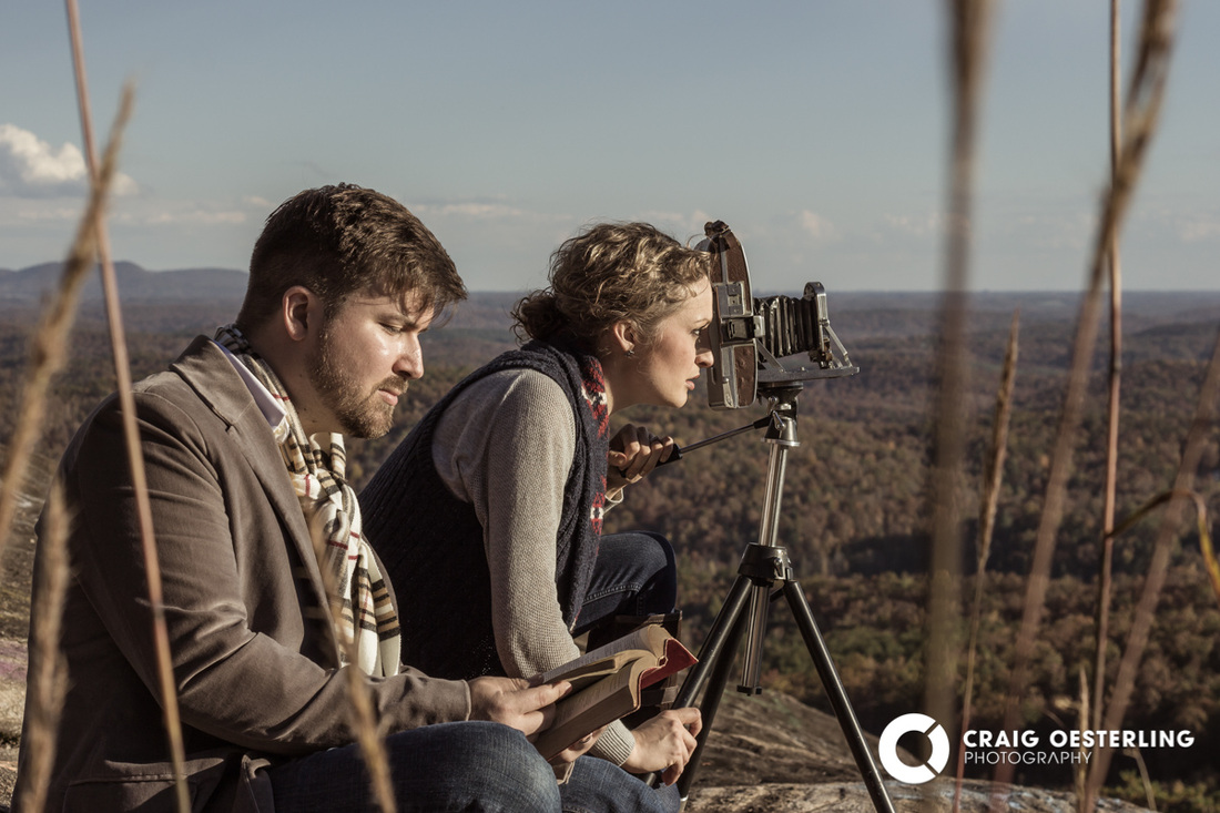
I created a few different editing styles. I like this more desaturated, color-toned vintagy feel.
I love this one! ~ I'll have to use the graffiti-be-gone brush . . .
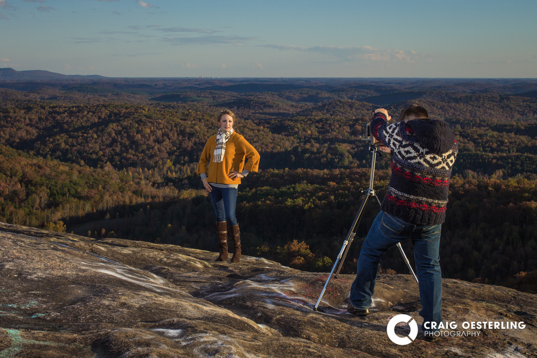
Dave, doing what he does. ~ It's hard to see in this small version, but downtown Greenville is on the horizon just above Rachel, and that is Paris Mountain on the left.
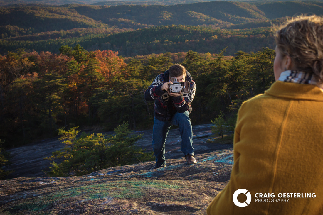
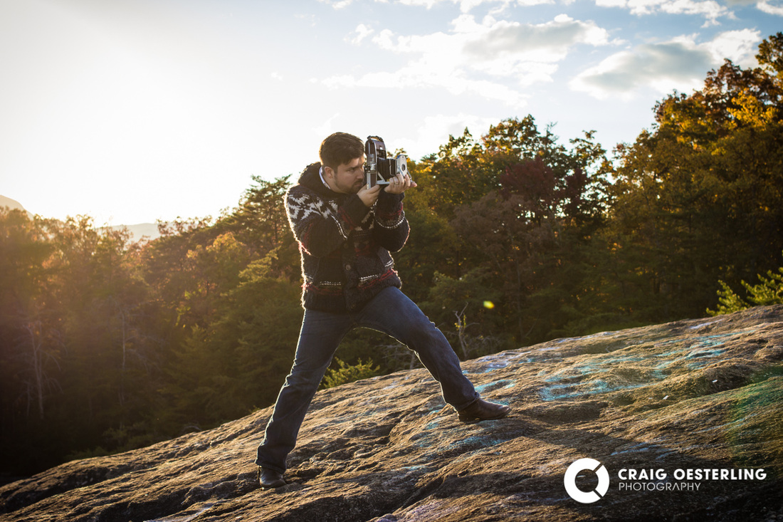
I hope he got the shot! ~ I know I did.
Aaannd, last but not least, the best shot of the set! Well, 10 shots, actually. This is what we went up there for. One of my signature panoramas, portrait-style. 39" long! And look at that lighting! Gorgeous sunlight as a rim with my strobe pumping it in as the key light. Epic! 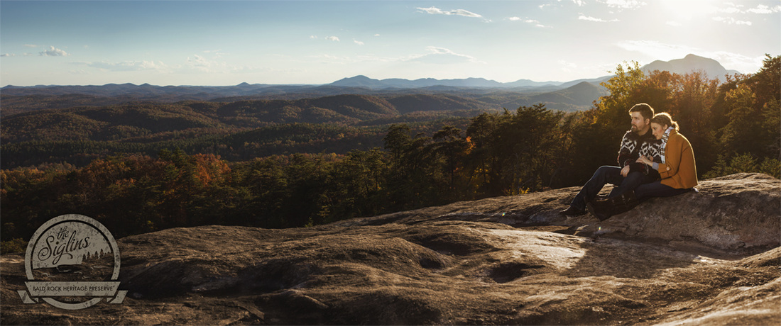
This panorama is made of 10 shots, and it's almost 40" long.
Thanks, Dave & Rachel for all you two did to make this shoot happen.
And thanks to my dad for being my lighting assistant, keeping my equipment safe! If you've read this far, please drop me a note to let me know what you think. Which is your favorite image, and why? Did this spark any ideas for a shoot you'd like to try sometime? Get in touch! I'd love to create more of these images with you! I'm excited to share that my images from this year's EURO Auto Festival are being used on the official EURO website! Not only are many of my images in the User Photos gallery, but two of my images are being used as page headers! The red Ferrari 330 2+2 photo at the top of the "2013 Winners" page is mine, as is the F-40 wing shot at the top of "2013 User Photos". http://euroautofestival.com/2013-user-photos/ 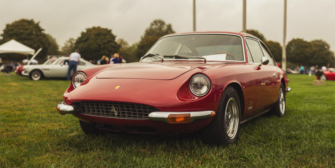 In addition, the Chairman of the EURO Board of Directors would like me to shoot for them officially next year. So! That's pretty amazing.
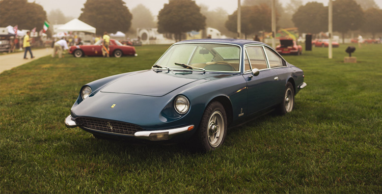
Here's to next year's show!! And no, I won't tell you what the featured marque is. ;-/ This afternoon I did a fun shoot with some friends up in the mountains. It was mostly a time for me to experiment, but with our combined creativity I think we came up with some pretty great images. I'll be posting them soon! I've been trying something new for a little while now when I shoot cars. A method of shooting that gives me a very shallow depth of field, maintains a close-in perspective, and eliminates a lot of the edge distortion associated with wide-angles lenses. I shoot cars like panoramas. Multiple shots stitched together to create one (hopefully) seamless composition. Usually, it works. But even when it works, there are still errors to fix. Cars have complex curves, and even the slight movement of my camera between shots (I always handhold these) slightly changes the perspective on those lines and curves. Photoshop can do a magnificent job of stitching images together, but I always have to check the seams and fix pixels that don't match up. The resulting image is also much larger than a single-shot image would be. Many of my stitched car shots are around 36" at full-print resolution! So it's a little tedious, but totally worthwhile. 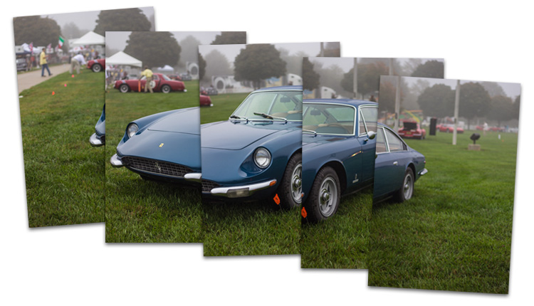
I recently had the opportunity to do some retouching for a gentleman who came to me with a troop panorama from around 1918. It had some heavy water damage and was missing a good chunk of the image, as you can see. He wanted me to see if I could pull out two soldiers from the center of the image and get rid of the guy kneeling in front of them. As you can see, I made it work! While I was at it, I enhanced the image's contrast and a few other details to result in a better print. 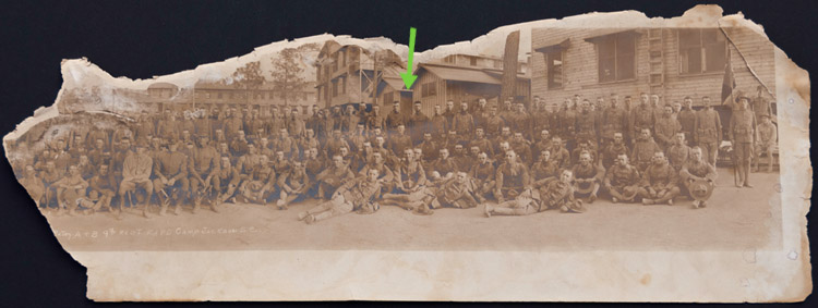
Here is my scan of the original image. The green arrow points to my client's relatives.
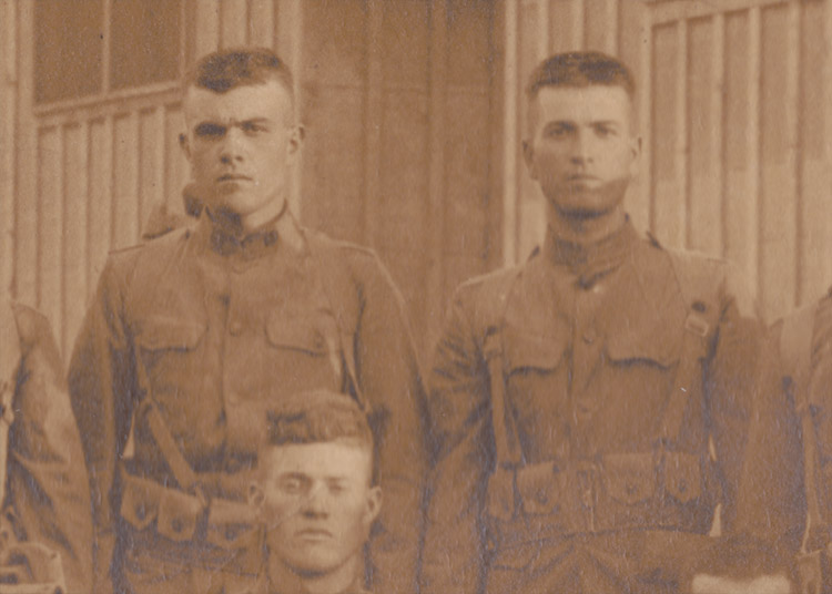
5x7 crop of the original scan
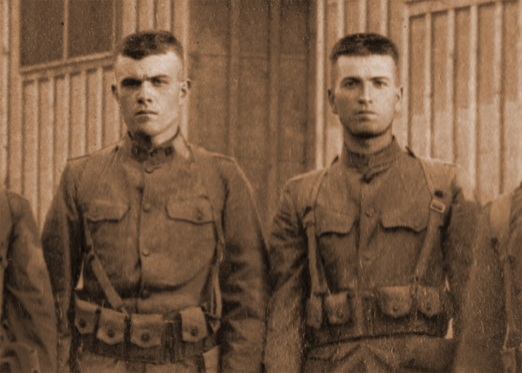
He's gone! Image . . . enhance!
Thanks for coming to my brand spankin' new website! I'm excited to finally have a web presence and I hope to keep it up to date. If I can place the occasional wallpaper here on my blog I will; I haven't dug that deep yet. Check out my galleries and leave me some feedback! Thanks.
|
Archives
May 2014
Categories |

 RSS Feed
